Babaton Fall 2018 Seasonal Colour

Colour for Babaton Fall 2018 meant a shift towards rich colour as opposed to a more neutral palette, as found in previous seasons. A shift for a sophisticated palette called for colours that could layer in monotones or colour into lavish and textured fabrics.

ARITZIA_FA18_BABATON_PORTFOLIO-01 (1).png

The Babaton customer relies on a heavy neutral-centric palette to carry a primarily minimalist and classic wardrobe through multiple seasons. Selecting the right shades becomes incredibly important as these colours become the foundation of the season.

ARITZIA_FA18_BABATON_PORTFOLIO-02.png

For Fall 2018, research showed me that off-whites were very creamy and warm, and greys were on the cool end. To partner with this cool grey, we picked a light blue that was both seen across the runways and marked as a market top seller.

ARITZIA_FA18_BABATON_PORTFOLIO-14.png

Camels and rusts were incredibly important when researching and selecting neutrals for Fall 2018. Seen on the pre-fall and fall shows of Gucci, Dries Van Noten, Celine, and, and Acne, it proved to be a must-have for this palette.

ARITZIA_FA18_BABATON_PORTFOLIO-07.png
ARITZIA_FA18_BABATON_PORTFOLIO_Inspo3.png
ARITZIA_FA18_BABATON_PORTFOLIO-11.png

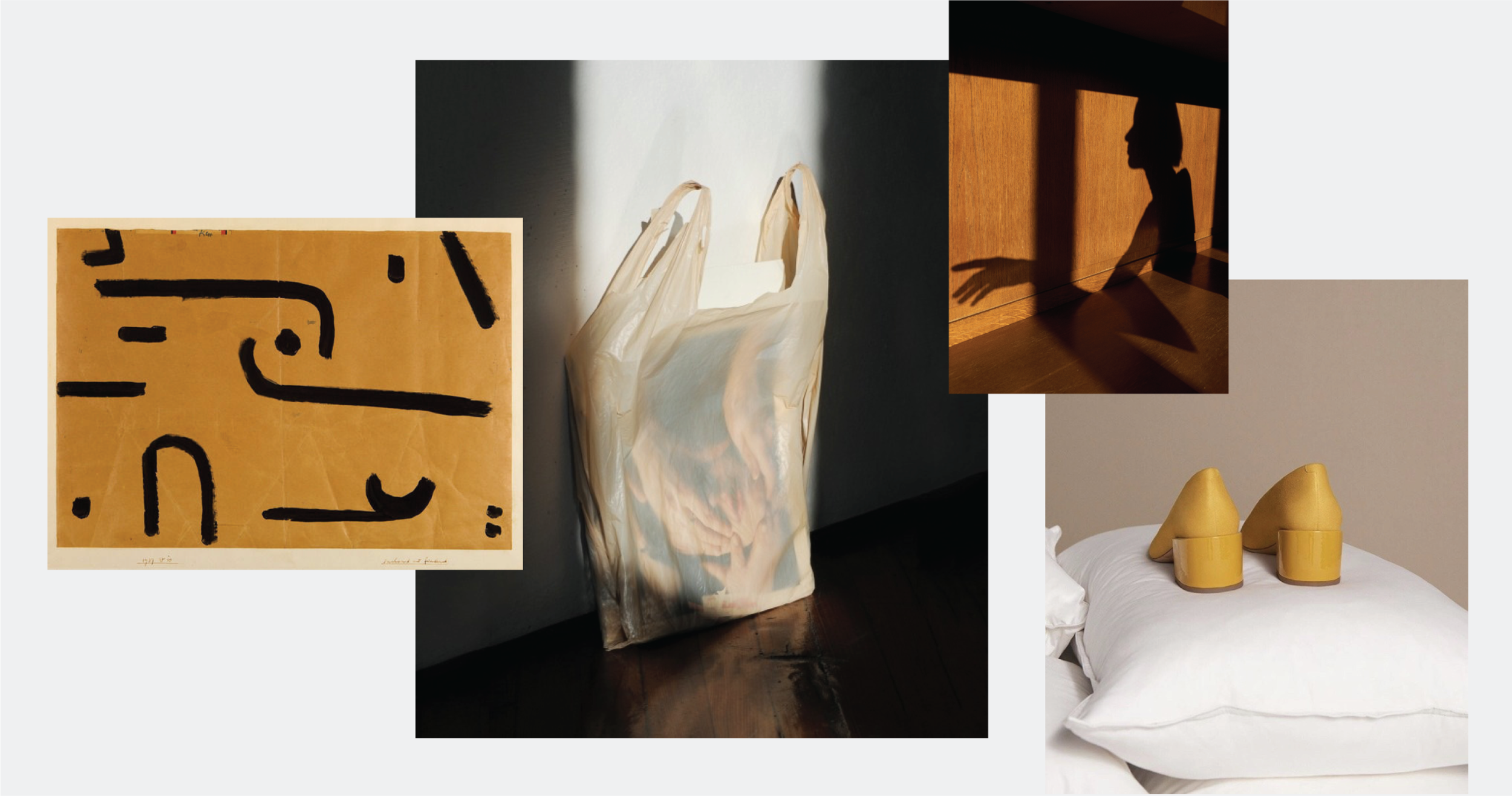
Rich yellow and gold was a big callout through trend forecasters was also an up-and-coming colour through extensive market research. In addition, it was a runway favourite, as seen through the lens of Celine, Acne, Tibi, and Victoria Beckham.

This was a very new colour direction for Babaton and proved to look and feel very fresh through merchandising in both e-commerce and in-stores.


Prior to this season, navy had been the go-to neutral should the customer want something different from black. But there had been a continued turn for greens in both jewel tones and forest shades. Seeing as we were aiming for colour layering, this rich green was combined with a stone green inspired by Celine and lifestyle brands.

ARITZIA_FA18_BABATON_PORTFOLIO-08.png
ARITZIA_FA18_BABATON_PORTFOLIO-12.png
ARITZIA_FA18_BABATON_PORTFOLIO-04.png
ARITZIA_FA18_BABATON_PORTFOLIO-09.png

Bright red proved to be incredibly successful when introduced a few seasons prior, and seeing as it was also currently a mainstay on the runway (Celine, Tibi, Balenciaga, Victoria Beckham, etc etc) as well as a top seller in the market, it only made sense to bring it through the Fall 2018 collection.

Rio Raspberry was a colour we pulled in for interest and the ability to mix within shades of red or green. It was a beautiful addition that pulled together both warm and cool colours together.

ARITZIA_FA18_BABATON_PORTFOLIO-13.png
ARITZIA_FA18_BABATON_PORTFOLIO_Inspo5b.png
Previous
Previous

stori chapter 1 2021

Next
Next

wilfred spring 2018 colour