


Wanderlust 2015
This year’s collaboration with Wanderlust was an exciting project. I conceived the original direction, print strategy, and colour palette in order to create the best selling Wanderlust collaboration to date. The Wanderlust team really sees the festival as a transformational weekend. You come, peel off the layers and leave feeling lighthearted and super renewed on life.
Hearing them get lit up about it immediately started creating ideas. We brainstormed and came to this idea of Metamorphosis in Nature.
Like a caterpillar cocooning into a butterfly—that’s kind of what happens at Wanderlust. You start out in your shell and by the end of the weekend, your wings are out! Essentially, We wanted to bring that into the product, and I created a feather print and the below metamorphosis print.
Concepts.
I originally presented a half dozen ideas, all of which spoke a similar language; it needed to be Soft, organic, and feminine. The team was really attracted to the transformational aspect of the caterpillar and butterfly but thought the softness of the feathers could also serve as a sort of soft and feminine camouflage. And to add, they both really spoke for the theme and mood of the festival.
Like a caterpillar cocooning into a butterfly—that’s kind of what happens at Wanderlust. You start out in your shell and by the end of the weekend, your wings are out! Essentially, We wanted to bring that into the product, and I created a feather print and the below metamorphosis print.
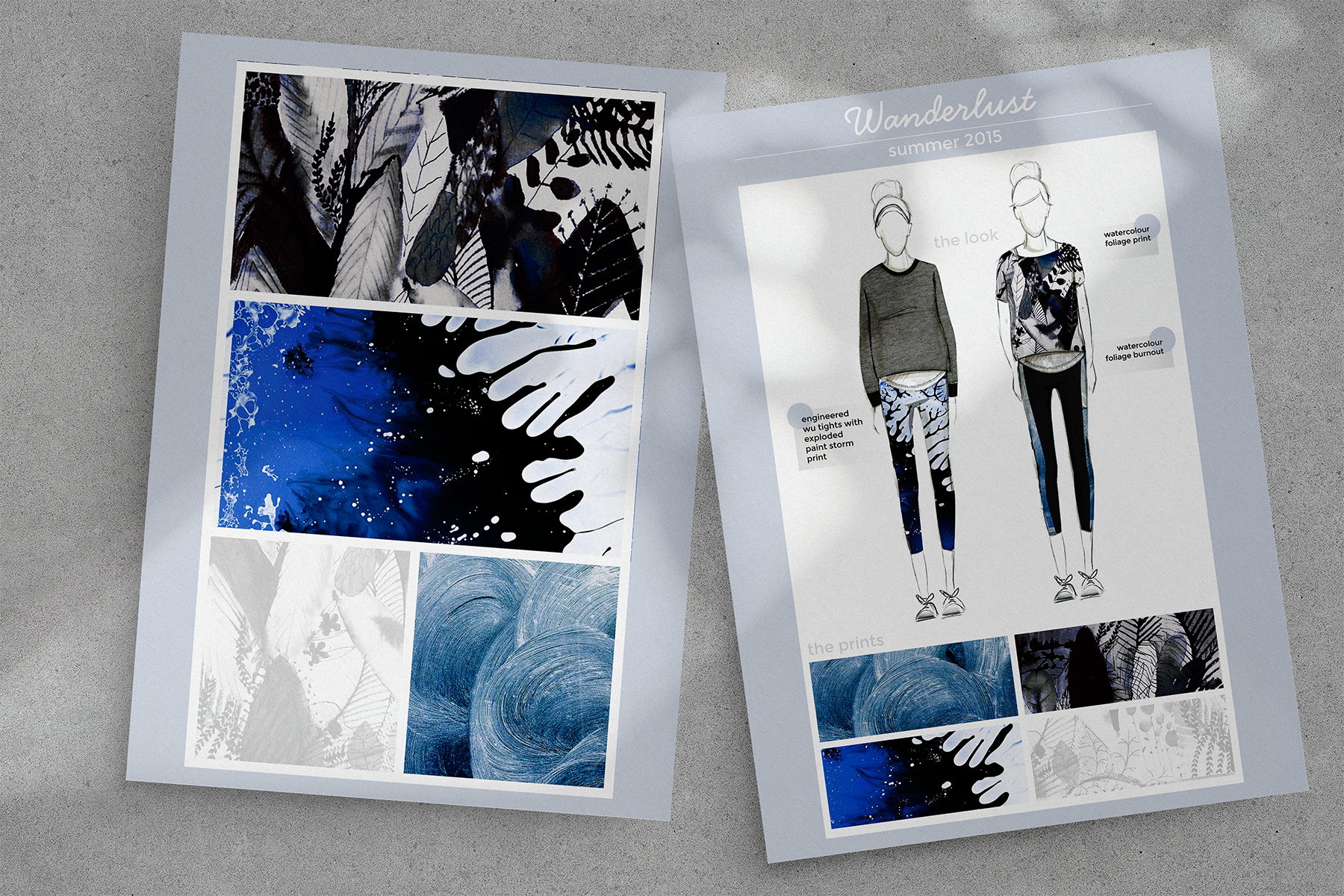


The metamorphosis print was meant to be the WOW print; the print she would want to wear as a statement at the festival and the print she would want to take home as a token of the weekend. The feather print was much more subdued and gave her the option to go more textural. It’s much prettier and more feminine and could also work easily with the remainder of her wardrobe.


